
––
RESPONSIBILITIES
• User Experience
• User Interface
• Responsive Design
––
DESCRIPTION
The new DataScience.com posed two major challenges. The first was telling a much richer story about a newly developed SasS platform, and the second was rebranding to move away from stock images, dark colors, and cluttered design to a lighter, more welcoming look and feel with the product at the forefront.

SITEMAP
I started by working with the executive and marketing teams to define a sitemap that would inform the entire design process.

WIREFRAMES:
The next step was to create a detailed set of wireframes, starting with sketches and then moving into high fidelity wires to really get a feel for balance of information. At this stage, I had to think about how these designs could be templatized for ease of scalability during the development process. This also required explorations for a fully responsive design functional across desktop, tablet and mobile devices.

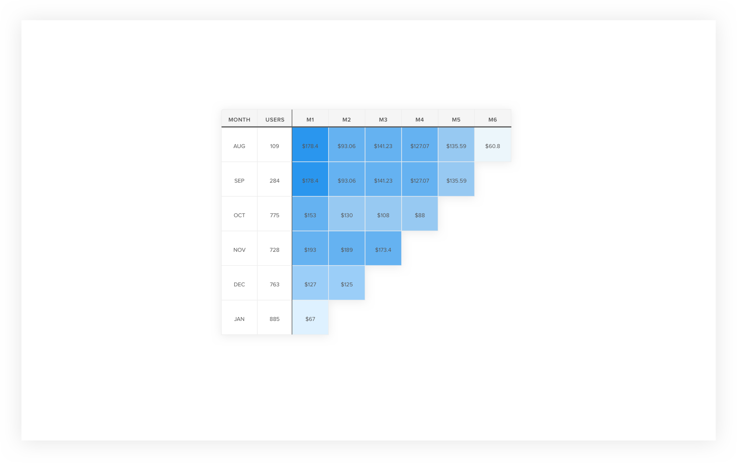
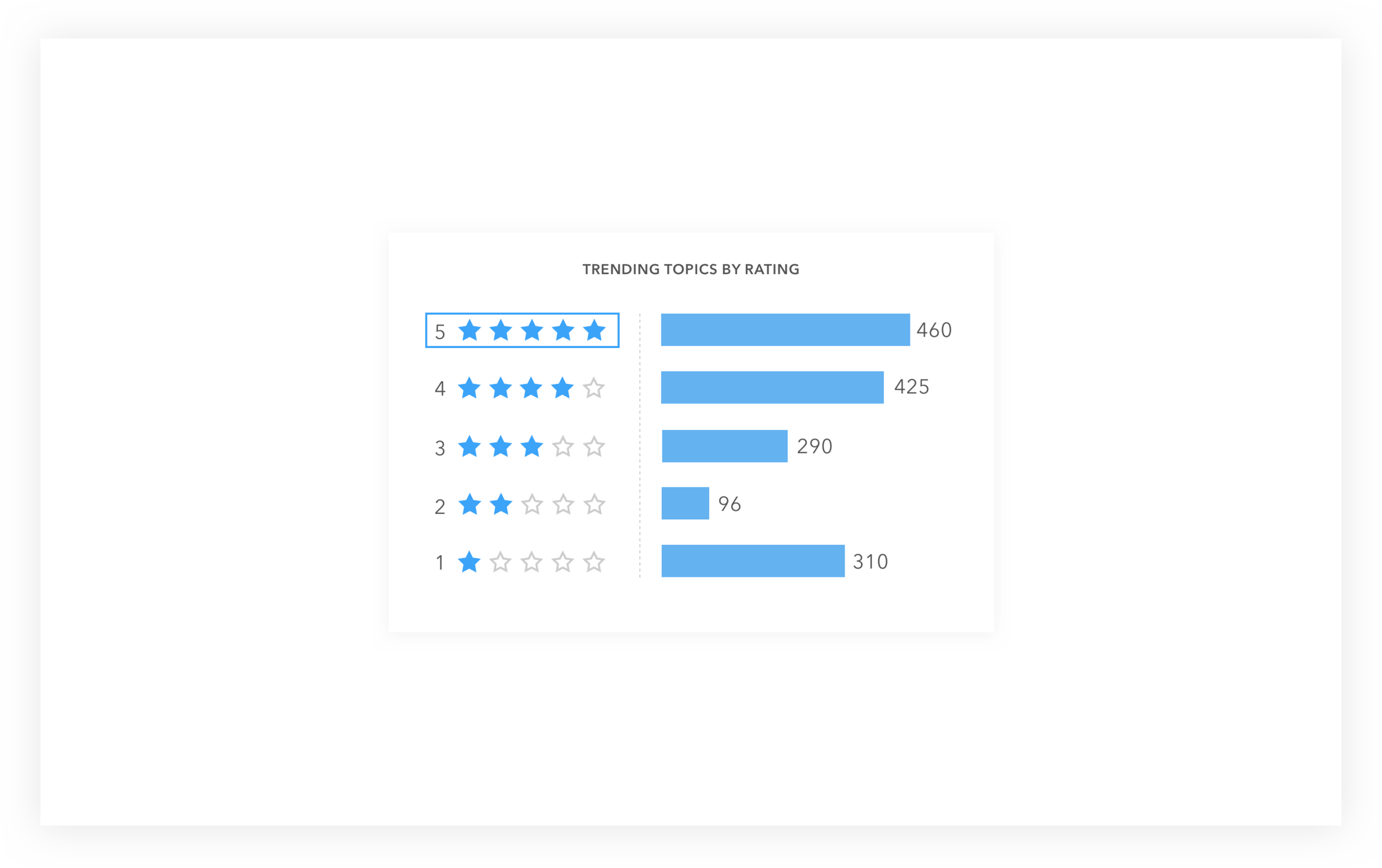
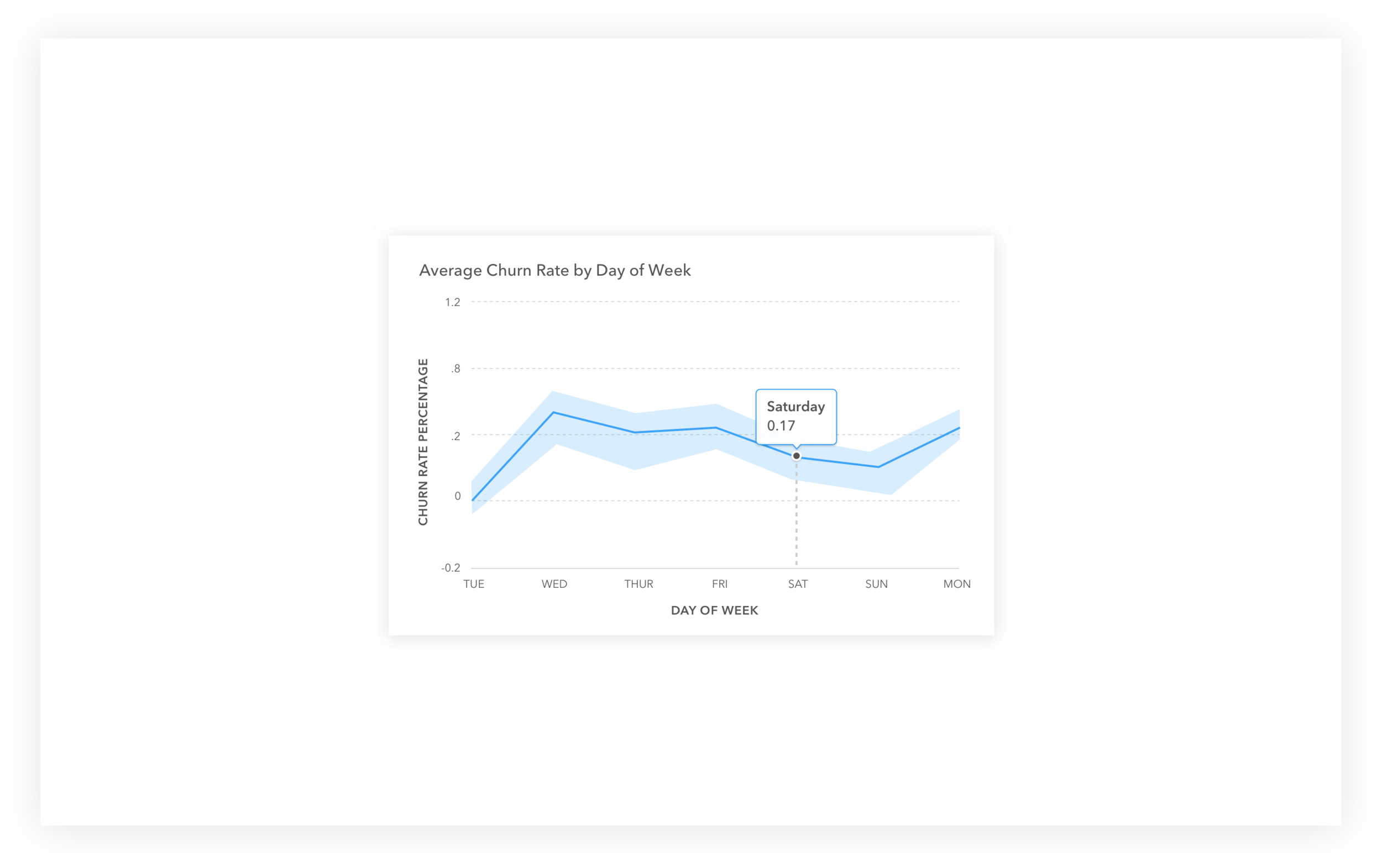
Data Visualizations:
Once we jumped into visual design, I took the liberty of creating technical illustrations to pair with our copy and help tell the story.
HI-Fi DESIGN
The last stage of the process was creating the final visual designs for the core patterns and templates established. After creating these, I helped translate this work into a style guide to make sure these styles could remain consistent as the company evolved.

RESPONSIVE DESIGN
